Resize Handles
By default, circular resize handles are used to resize the box. These handles are ideal for accessibility and can be modified to create any type of resize handles.
Use handleTapSize to change the size of the invisible interactive gesture area that is used to resize the box.
The handle tap size is always larger than the handle to improve accessibility.
handleTapSize does not change the size of the handle UI. TransformableBox(
rect: rect,
flip: flip,
handleTapSize: 34,
onChanged: (event) {...},
contentBuilder: (context, rect, flip) {...},
);
You can customize the default handles or build your own handles using the cornerHandleBuilder and sideHandleBuilder
properties in the TransformableBox constructor. They both provide access to the BuildContext and HandlePosition
of the appropriate handle.
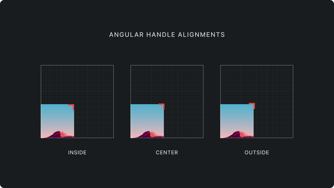
You can use HandleAlignment on TransformableBox to change the position of the handle's interactive area. By default,
the interactive area is aligned to the center of box corner/side.
  TransformableBox(
    rect: rect,
    flip: flip,
    handleAlignment: HandleAlignment.inside,
    onChanged: (event) {...},
    contentBuilder: (context, rect, flip) {...},
  );
Handle visibility
By default, handles will be hidden when resizable is set to false.
  TransformableBox(
    rect: rect,
    flip: flip,
    resizable: false,
    onChanged: (event) {...},
    contentBuilder: (context, rect, flip) {...},
  );
You can alternatively selectively hide handles by providing your own visibleHandles set.
  TransformableBox(
    rect: rect,
    flip: flip,
    visibleHandles: {HandlePosition.right, HandlePosition.bottom, HandlePosition.bottomRight},
    onChanged: (event) {...},
    contentBuilder: (context, rect, flip) {...},
  );
Handle Interaction
You can selectively disable handles but keep them visible at the same time by providing your own enabledHandles set.
  TransformableBox(
    rect: rect,
    flip: flip,
    enabledHandles: {HandlePosition.right, HandlePosition.bottom, HandlePosition.bottomRight},
    onChanged: (event) {...},
    contentBuilder: (context, rect, flip) {...},
  );
Customizing the default handles
By default, TransformableBox uses DefaultCornerHandle and DefaultSideHandle to build the handles. You can
customize the default handles by providing a custom decoration and size to the DefaultCornerHandle and
DefaultSideHandle constructors.
  TransformableBox(
    rect: rect,
    flip: flip,
    cornerHandleBuilder: (context, handle) {
      return DefaultCornerHandle(
        handle: handle,
        size: 34,
        decoration: BoxDecoration(
          color: Colors.red,
          shape: BoxShape.rectangle,
        ),
      );
    },
    sideHandleBuilder: (context, handle) {
      return DefaultSideHandle(
        handle: handle,
        length: 34,
        thickness: 12,
        decoration: BoxDecoration(
          color: Colors.red,
        ),
      );
    },
    onChanged: (event) {...},
    contentBuilder: (context, rect, flip) {...},
  );
Since, side handles are not square, you can use the length and thickness properties to customize the size of the
side handles.
Custom Handles
You can also use cornerHandleBuilder and sideHandleBuilder to build your own handles. You can use any widget
to build the handles.
  TransformableBox(
    rect: rect,
    flip: flip,
    handleBuilder: (context, handle) {
      return MyCustomHandleWidget(handle: handle);
    },
    onChanged: (event) {...},
    contentBuilder: (context, rect, flip) {...},
  );
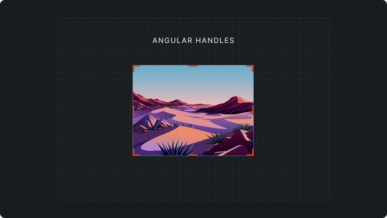
Angular Handles
You can use AngularHandle to build angular handles that look like corner brackets.

AngularHandle can render both corner handles and side handles. TransformableBox(
rect: rect,
flip: flip,
handleAlignment: HandleAlignment.inside,
cornerHandleBuilder: (context, handle) {
return AngularCornerHandle(
handle: handle,
handleAlign: HandleAlign.inside,
);
},
sideHandleBuilder: (context, handle) {
return AngularSideHandle(
handle: handle,
handleAlignment: HandleAlignment.inside,
);
},
onChanged: (event) {...},
contentBuilder: (context, rect, flip) {...},
);
Use handleAlignment to align AngularHandle to the inside, outside or in the center of the box.


